 |
|
|
Examples
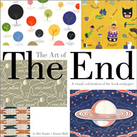
Lavishly illustrated
with over 240 vintage and contemporary endpapers, The Art
of The End provides a graphically stunning look at imagery
intended to tell a story, set a tone, evoke playfulness, or even
hypnotize a reader through geometric patterning. Whether created
for adults or children, book endpapers are universally appreciated
for their poetry, simple beauty and visual drama they evoke when
fully unfolded. Examples like these will be reproduced and outlined
in the book.
|
|
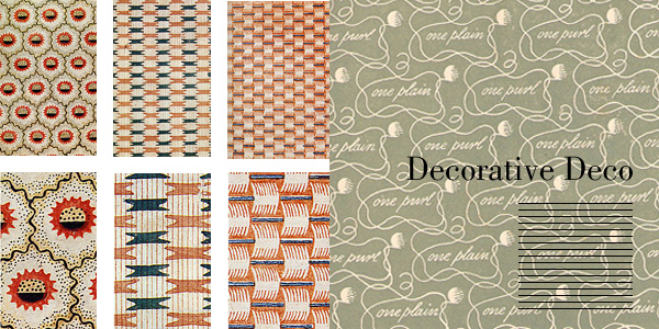
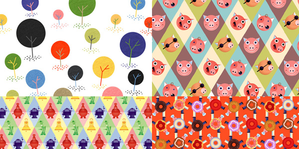
| By far the most common aesthetic technique
employed by endpaper designers is the repeat pattern. By creating
a visual element that can be "wallpapered", the repeated
image maintains an almost hypnotic effect on the reader. These
Art Deco-inspired patterns from the 1940s invite the reader to
study them at coser range to more fully and better appreciate
their reproduction quality, colors, and even the texture of the
paper on which they are printed. |
|
|
 |
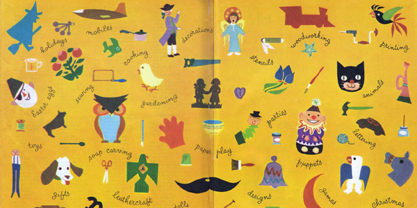
| Illustrators, especially those working
in picture books, have always reveled in the uncommon opportunity
afforded them to create front and back endpapers for their books
-- particularly since the large print area allows them to visually
stretch their wings. In this 1953 craft-oriented 'McCall's Giant
Golden Make-It Book' for kids, illustrator John Peter creates
simple, iconic elements and hand-lettered type to playfully suggest
the how-to activities found within the book itself. |
|
|
 |
| While not as common in contemporarily
published books, endpapers were once prevalent in almost every
type of book, no matter how parochial. In this 1938 step-by-step
knitting book, the designer creates an almost ethereal and dreamlike
motif suggestive of the night sky - complete with stars and balls
of yarn that seem to eclipse full moons. |
|
|
 |
| The endpapers for Bob Staake's picture
books are almost always repeat designs of some sort, whether
geometric or randomized. "I almost always take a decorative
approach on my endpapers", says Staake, "but the more
books I do, the more I like to challenge myself to dothings in
new and unexpected ways. I can see doing endpapers for a book
in which I simply create a lavish scene that a kid can lose themselves
in - rather than simply creating a playful wallpapered image.
In 'The DonutChef' (2008 - Random House), Staake created balancing
chefs comprised of donut bodies. In the front ed papers they
are against a orange background, in the back they're against
green. "I liked both colors", said Staake, "and
couldn't decide on one -- so I thought I might as well use both." |
|
|
 |
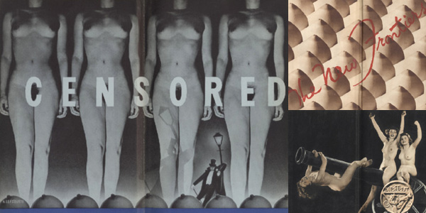
| Founded in New York City in 1905, the
Dutch Treat Club was a male-only social club comprised of writers,
illustrators, cartoonists, and other creatives. Their regular
Tuesday stag lunches were, from all accounts, raucous affairs.
Since 1920, the group published an annual yearbook "known
for its risque drawings, illustrations, cartoons and photographs
of nude or semi-nude women" -- and the yearbook's spectacular,
photo-based endpapers unabashedly exploited the same fleshy subject
matter. |
|
|
 |
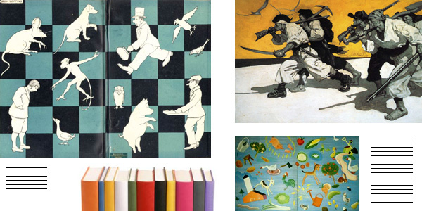
| By using a limited color palette of
black, white and teal, the endpapers for the UK-edition of 'Doctor
Doolittle' "read" as simple decoration. Using a similarly
reduced color palette of blacka, whites and grays against a swath
of sunflower yellow, master illustrator N.C. Wyeth chooses to
illustrate a single scene within 'Treasure Island' -- a dramatic,
testosterone-laden vision of six pirates marching across the
barren sands. Wyeth effectively turns up his nose at the traditional
nature of the endpaper as one of mere decoration by using the
space to pique the reader's curiosity and compel them to flip
through the book -- a calculated engagement that within a bookstore
environment, would likely result in a sale. |
|
|
 |
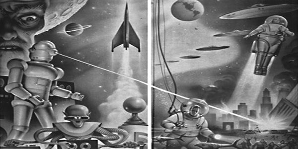
| Fantastical worlds in air, space and
even underwater are conveyed with nothing more than grayscale
brush strokes. These beautiful, over-the-top endpaper images
of laser-firing robots, multi-armed alients, jetpack-equipped
spacement and hovering ufos are clearly intended to appeal to
the boy of 1946 America. |
|
|
 |
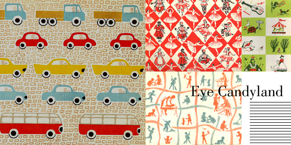
| Playfully simple and sweet, this parade
of cloned trucks, cars and buses evoke a nursery room naivete
and connects the child reading the book with the elemental, comforting
and cisually-reduced images. |
|
|
 |
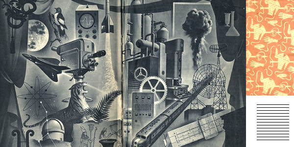
| The endpapers for a child's science
primer utilizes a montage approach and over a dozen seemingly
disconnected elements to create an intoxicating, hybrid scene.
Assembled in an almost puzzle-like fashion, each element drives
the reader's eye to a new image and forces the eye to circle,
scan and investigate the scene each time the book is opened. |
|
|
 |
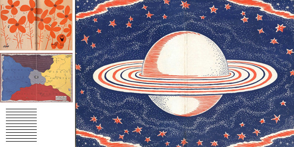
| Naive and folksy in its design and
rendering, this imperfect saturn-oriented set of endpapers is
no less engaging than an expertly illustrated scene like the
one above. Looking at the endpapers, the eye only notices the
fact that it is imprinted with only two colors (blood orange
and royal blue) against the white of the paper, a testament to
the scratching of the pen line that creates the illusion of lighter
blues and more muted oranges. |
|
|
 |
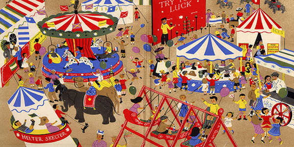
| By creating an idyllic world of carefree
innocence, the illustrator of this 1962 endpaper environment
invites children to imagine themselves within the scene. A study
in careful action placement, the illustration reads as busy,
but all the action is carefully constructed. This is because
the illustrator has allowed a static, solid color of tan to represent
the ground and it is the lack of disruptive details within the
backdrop that keeps the image from tilting toward the baroque
and chaotic. |
|
|
 |
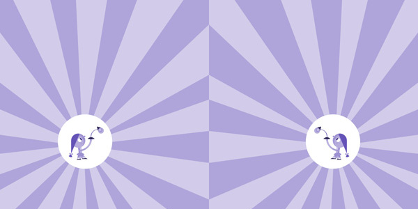
| Knowing that the endpapers for 'Mary
Had A Little Lamp' (2008 - Bloomsbury) would have to be reproduced
in a single color, illustrator Bob Staake elected to suggest
the abstracted, glowing rays of light and place Mary in the center
of the circular light. In the story, the small kitchen appliance-obsessed
Mary ultimately falls out of love with her gooseneck lamp and
adopts a toaster as her new best friend. Asked The End
co-editor Kristen Held of Staake "Why didn't you make her
holding the toaster on that final endpaper page?". Staake
thought for a second. "You know", he said, "the
endpapers would have been so much better if I had done
that!" |
|
|
 |
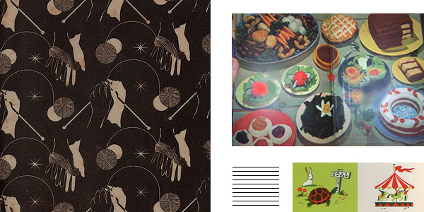
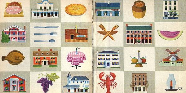
| Various restaurants, food items and
utensils suggest both a visual menu and a pre-schooler's image-based
ABC book. These, however, are the comforting endpaper visuals
froma 1970 Better Homes and Gardens-published travel guide. Locking
each element against its own checkerboard square keeps the overall
design orderly and conservative, but no less yummy. |
|
|
 |
|